- Home
- About Us
About Us
GET A COMPLETE WEBSITE DESIGN
Get a complete WordPress website design with website hosting, IT support, unlimited pages, products, emails, SEO, CMS and more for just £10/month.
WHO WE ARE
A PASSIONATE & ENERGETIC TEAM

Dial a Website is part of the Excite Technologies company, it is a professional website design agency based in the UK, specialising in website design, web development, website maintenance, web hosting services and Search Engine optimisation.
If you are looking for one of the best web design company in London then you have come to the right place. We seek to go beyond our client’s expectations and provide them with top quality custom websites of any category. We provide our customers with everything they need so they can concentrate on running their business and not worry about any website issues such as running out of webspace, updates, security etc..
There is no long term contract so you can stay with us for as long or as short as you wish.
100% SATISFACTION GUARANTEED
STANDARD FEATURES
THE FOLLOWING ARE STANDARD ON ALL OF OUR HOSTED WEBSITES:
- Complete website design
- Unlimited Website Hosting
- Unlimited web space
- Unlimited bandwidth
- Unlimited pages
- Unlimited products
- Unlimited free updates
- Free website visual builder
- Unlimited emails
- Free Joomla/Wordpress CMS
- Free technical support (phone and email)
- Free search engine optimisation (SEO)
- Free submission to top Search Engines like Google, Yahoo. AOL, MSN
- Free visitor website statistics
- Automatic Google site map creating
- UK located reliable website hosting
- Your own personal web manager
All of our websites are
RESPONSIVE WEB DESIGN
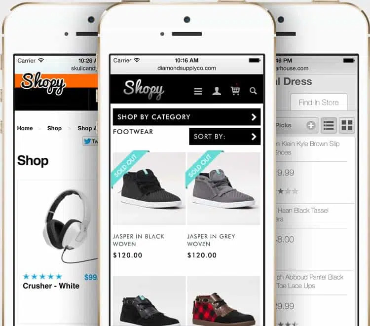
For those that are not familiar with the term ‘responsive web design’, the simplest definition I can give is that a responsive web site is optimized for viewing (i.e. looks good) on different types of devices, screens and resolutions. In other words the design adapts to the available viewing space offering the user with a nice experience without having to move left and right with a scroll bar or zoom-in, zoom out in order to read the text or view an image.
It’s more pleasant for your readers. There are no inherent limits on screen dimensions like you have with AWD. While responsive site designs are guaranteed to work well on any screen size, adaptive designs only work on as many screens as its layouts are able to.
Finally, responsive websites are typically far more cost-effective than a dedicated mobile website. All of our websites are developed as responsive right out of the box, this eliminates both time and expense from your development budget.

Our Principles of
EFFECTIVE WEB DESIGN
PURPOSE
We provide good web design that always caters to the needs of your website user. Each page of your website will have a clear purpose, and to fulfill a specific need for your website users in the most effective way possible.
COMMUNICATION
People on the web tend to want information quickly, so it is important to communicate clearly. We make all your website information easy to read and digest. We also provide communication via phone, email and WhatsApp.
NAVIGATION
Navigation is about how easy it is for people to take action and move around your website. We use effective navigation such as logical page hierarchy, using bread crumbs, designing clickable buttons, and following the ‘three click rule’ which means users will be able to find the information they are looking for within three clicks.
GRID BASED LAYOUTS
On all of our websites, we use the grid based layouts because placing content randomly on your web page can end up with a haphazard appearance that is messy. Grid based layouts arrange content into sections, columns and boxes that line up and feel balanced, which leads to a better looking website design.
LOAD TIME
Everybody hates a website that takes ages to load. On our websites, we make page load times more effective by includeing optimising image sizes (size and scale), combining code into a central CSS or JavaScript file (this reduces HTTP requests) and minify HTML, CSS, JavaScript (compressed to speed up their load time).
MOBILE FRIENDLY
All of the websites we design are mobile-friendly by default because It is now common to access websites from multiple devices with multiple screen sizes. Your website will now look beautiful on every device.

